Sunday, 20 February 2011

The National Gallery

The National Gallery logo seems to just be a type face than a logo. However, clearly this font was chosen for a reason, to convey a certain message, but further thought does not seem to be put into the decision. 
After viewing the collections I think more could be done with this typeface, maybe a color change or a background color. But I understand their simplicity and lack of logo since the museum itself is quite overwhelming. 
The changing wall colors of the galleries at the museum complement the works each room holds. I think the palettes also add to the overall feel of the pieces and intensify the experience of seeing such legendary works, which works for the museum - as do the white minimal walls of the Tate Modern. 
In my opinion, the van Gogh paintings definitely lived up to their position in art history! They even exceeded my expectations; with their vivid colors and lively brushwork I felt so awestruck in their presence. Wheat field with Cyprysses was a work i never imagined I'd be so amazed by. Standing about 8 feet away from it was the view point i though really did the work justice and to really see the artistry of van Gogh's brush work and coloration. 
The painting that would be most suitable for my future home would have to be of my favorite impressionist artists, Claude Monet. The beautiful painting The Beach at Trouville is aesthetically pleasing and apparently contains actual grains of sand from the beach on which he painted this scenic portrait. 
My favorite object from the National Gallery was Degas's After the Bath a Woman Drying Herself (1890-1895). This also might be an object I'd love to put in a future home. The beauty and admiration of the female figure is conveyed simply and elegantly with the medium of pastels. The flexibility and contortion of the body was an intrigue to Degas, and I would like to study other similar works to compare and contrast this to, especially of dancers. 
 I don't think plastering images of the works in the collection on handbags and such exactly diminishes the value of the original works, but i personally see it as tacky. I think that it's an interesting way to spread the image and make it more accessibly seen. Purchasing this merchandise though, is more affordable way to express a liking or taste in certain works as opposed to going to the Louvre or Tate Modern or Art Institute to see it and snap your own photo to prove you like something and saw it. 

Sunday, 13 February 2011

The Tate Modern


The Tate Modern building from the outside is quite cold, sort of resembling a prison. It's location however, directly at one end of the Millennium bridge adds to it's Modern feel. The building, not really looking like a museum, is not what I would choose to house a modern collection, but works fine. 
The logo of the Tate Modern varies in a range of blurred effects. The slight alterations of the blurred effect is a little distracting and conveys a sense of inconsistency, that perhaps was purposeful, but I find unnecessary. 
I wouldn't say that the museums in the United States are exactly for the rich, but more for those truly interested in taking the time to experience what museums have to offer. Obviously not everyone can afford to go to museums priced so highly as often as they could here in London, but this could motivate some of the public to put more effort in the outing. The free museum admissions impact the London culture in a positive way, making it more accessible to the public and allowing anyone the opportunity to explore their desired interests as well as offering new interests.  
I don't mind the white walls of the exhibition spaces within the Tate Modern. I believe this neutrality allows for a distraction-free experience for observing the works. The areas between displays, such as the wall of signatures and the timeline of different art periods is a good visual transition between spaces. 
The Unilever Series, comprised of millions of individual porcelain sunflower seeds was not personally intriguing to me. While I respect and see how interesting the time and work that went in to creating this installation and the obvious message message it conveys, it is not my taste. I prefer gallery pieces like paintings, photos and sculptures. 
Seeing the works of artists that I've studied in classes is always very exciting for me, and I find the period of Pollock's work to be the one of the most interesting I've studied. My favorite piece at the Tate Modern was Jackson Pollock's Number 14 (1951), from a period in his career that I have not studied much. It's different from his more famous works and I find it aesthetically pleasant and more simple in relation to those others. 

Friday, 4 February 2011

The Tate Britain


The Tate Britain museum's logo is so far the most unique of those we've critiqued. What bothers me about this logo is the energy it gives off; it seems to be the font one would see on the cover of a horror film, which I believe contrasts the meaning and status that the "Tate" name holds and stands for. Aside from this, the fading of the letters gives it a modern feel clearly relating to the galleries and collections within this museum. The architecture however, is classical in style, juxtaposing many collections found inside the Tate.
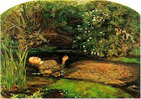
Last week we saw the production of Hamlet at the National Theatre. In the play, Ophelia's death is not depicted, but described through dialogue between the police and the King and Queen. It was said that Ophelia had fallen down a well. This lack of a visual depiction of her death held implications that she was in fact killed by authorities. This differs from Millais' painting of Ophelia's death firstly in that it is a visual depiction. Here, it looks as though she is entering a stream to drown herself. We see her right hand is still above water grasping a bundle of flowers and her face conveys a sense of disassociation- from life and sanity. 
The display techniques in the Tate differ greatly among galleries. In Gallery 11, the typical white walls hold large contemporary works. The simplicity of the art work parallels the simplicity of the room, which holds a few sitting areas is well lit. The light hits the pieces so that the colors appear bright and vivid. Gallery 9 holds art work created with through print making. These small paper works, framed and hanging were hard to look at, since it was not a well lit area. Each gallery speaks for the art work and installation it holds, and affects the way we experience the pieces and museum as a whole. 
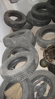
One very interesting installation was "The Coral Reef", by Mike Nelson. Walking into this exhibit blindly may not have been the ideal mind set for most, but worked for me. Opening the first two doors, I felt as though I was entering storage areas of the museum, feeling as though I shouldn't have been seeing this area and second guessing my direction. This second guessing stuck with me throughout my entire experience, and eventually came in handy as I attempted to exit and came across a room identical to the entrance. As I explored the many rooms, the smell of saw dust and cement, the dim lighting, creaking doors, and random objects strangely reminded me of childhood. I felt as though I was exploring my grandmother's basement or my father's garage as I had done as a young girl. The mysteriousness of what the next room would hold was intriguing, and brought me back to my youthful curiosity that was most evident when grandma would ask me to get her something from the basement… the questions of where to go, what might pop out at me, and what else I could find on my mini adventure always kept me wide eyed in the dark and cold underground. Although unconventional, I absolutely think this qualifies as art; someone created and arranged each particular space and the exhibit as whole with specificity, purpose, and a desire to connect with others evoking thought and emotion. 
The contents of the Tate were more appealing to me than the Victoria and Albert Museum, since I love exploring art. However, the space and architecture of the V&A is more open and welcoming than the Tate, making it hard to decide which experience I favored more. 
I didn't find any piece or object that I would call my favorite, but I did have a favorite room in "The Coral Reef" exhibit, and I did find a piece of work that jumped out at me. The work that jumped out at me was in passing so i was not able to stop and gather the information. It was a photography piece that caught my eye because of it's similarity to the work of my brother. I was so astonished that I had to take a picture to compare to my brother's art. 

My favorite room of The Coral Reef exhibit had few objects, just a crate holding various bottles and a newspapered floor, but a beautifully painted ceiling with a 6-pointed star and script writing surrounding the star in circles. This ceiling reminded me of a hang out room at one of my friend's houses back home in Chicago, which she and other friends painted themselves and where I've spent much time during high school and most times when I'm home for breaks. 
My overall experience at the Tate was great, and I will definitely return since I know there is much more to explore.