
Monday, 18 April 2011

The Wallace Collection


For this collection, because it's more of a home collection and not really a museum exhibit i think that the engraved labels on the frame works well. Also since there are a few rooms with quite an excessive amount of paintings hanging on the walls it would look kind of tacky to have a bunch of labels on the walls adding to this excess. Given this collection i prefer the engravings, but they work in other museums. 

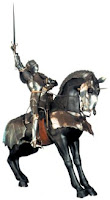
The object that most captivated my attention was the armour room. Immediately upon entering the room you see a 15th century 'Gothic' equestrian armour set, the armour is displayed on a horse and warrior mannequin and the intensity of the armor is quite captivating. It's shininess and intricate detail shows the amount of work and thought that went into making this; it's amazing that these armor sets were designed specifically for each warrior given different sizes and such.  
There wasn't an object, but a room with over the top decor that really put me off. The wall paper/fabric matched the drapes which matched the upholstery on the chairs. I was surprised there wasn't a carpet with the same fabric. I don't even think that this complemented the art work or objects which were in the room. I think a lot of the furniture that was displayed was quite excessive and overly ornate; many of the bookshelves and drawers were onyx and gold, making some striking and eye catching, but then would be painted with extreme detail and then accompanied by an angel woodcarving or something. Some things just got to be too much.  
My favorite museum experience was at the Saatchi Gallery. I enjoyed the tour that included some background to the artists of the pieces we were shown. It made the experience more engaging. I also think this gallery had some really interesting works that I could not imagine seeing anywhere else (i.e. the oil room). The pieces at the Saatchi are very original and through provoking and I liked that they don't provide explanation of the works, it forces the viewers to create their own opinions and ideas of what they see in art. 
I always enjoyed visiting art museums but I enjoyed the fact that with this course I visited some museums i may not have gone to on my own. I have a greater interest in going to more art galleries and now recognize and appreciate the branding and design that goes on more behind the scenes of the institutions. 

Steven, thanks for a great course and semester! I really enjoyed getting to know you and exploring London with you and the class! I was able to see a lot of art that i've studied and appreciate as well as learn about new and different museums and art. :)

Monday, 11 April 2011

Brit Insurance Design Awards: My Votes


Brit Insurance Design Awards

Architecture:
The Tape Installation by Numen/For Use
I found this tape creation to be really cool, and remind me of playing with tape as a child.  I thought it was very interesting that the concept for this was drawn from a dance performance and was turned life size. it also reminded me of hamster cage tubes.  


Furniture:
Thomas Heatherwick's Spun Chair is an innovative and interesting design for a chair. I thought that it kind of made sitting down fun, and suitable for people of all sizes. It's one of those things that you're kind of timid to try out for yourself but once you do you're glad to have tried it. It feel like you're about to fall over and then you just kind of spin around in circles like a top. 

Transport:
The Barclays Cycle Hire by Transport for London and Serco
I think this is a great idea for any city, I wish Chicago and Madison did this. Anyone can pay a pound to enjoy the sights of the city in a completely new way tan being driven around by some tour bus or walking until your legs collapse. This system also promotes exercise and healthy living as well as a 'green' way of getting to know London. 
Graphics:
Homemade is Best by Forsman and Bodenfors for IKEA
This interesting and artistic way of arranging different recipes is visually pleasing. The symmetry of the arrangements and the calming color scheme make the presentation interesting and beautiful. Everything looks so perfect and precise, which kind of goes with the idea of cooking-- people are always trying to get the exact amount of each ingredient needed. 
_______________________
Within minutes of entering the Wim Crouwel exhibit I was pretty disinterested. The posters lined along the wall were pretty small and not that eye catching unless the had extremely vivid or neon colors. The room was much too large to keep winding around the below the waist level cases that seemed to contain papers and images all very similar. The room was hot and over all quite boring. 
I'm not exactly sure why, but the overall exhibit kind of reminded me of a sculpture in Chicago- an untitled piece by Picasso in the Daley Plaza. Perhaps the rigid lines remind me of the text and architectural-esque quality of Crouwel's work. The colors used in the posters did remind me of some of the works by Mark Rothko who used vivid contrasting colors a lot to make them stand out against each other- as Crouwel seems to do. 


Monday, 4 April 2011

The Saatchi Gallery


The Saatchi gallery definitely offers various sightlines, for those works that aren't just hung on the wall. They leave room for you to walk around and observe many different pieces at once. This is different in some other museums, you can't typically go so close to some art works and at the Saatchi they almost invite you to touch some of the art. 
I like that the gallery uses very minimal text in relation to the art. Sometimes i felt that some of the works (sculptures particularly) where it would be nice to know the medium, or the process. 

I think that some of the works in the Saatchi gallery are a little adventurous. i think there are also some works that are questionable in subject matter. I like how different some of the pieces are though, namely the oil room i found to be extremely interesting. I can see many artists being discovered and popular because of the Saatchi, but i can also see some works that just will never be of wide-scale interest. 

Tuesday, 29 March 2011

London Street Art, Graffiti, Vandalism... and all in between

For you homework, you will address the following questions. 
Over the next week, please capture street art as you explore London. 
Identify two locations (art/graffiti) that enhance the landscape -and two locations (art/graffiti) that diminish the streetscape. Feel free to discuss your opinions of vandalism, notions of beauty, historical significance, etc. Integrate photographs into your blogs with a short response for each of the 4 images. 

While traveling through London this past week I encountered some imagery that falls in the gray area of street art/graffiti as well as some pointless tagging and/or 'vandalism'. I differentiate the two groups based on personal opinion of what I find eye catching, aesthetically pleasing, thought provoking, rude, or unnecessary. 

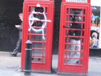
Unnecessary and rude usually encompasses spray painted tags on random streets vending kiosks, construction sites, backs of street signs, and unfortunately in this particular example, obnoxiously on a telephone booth in Piccadilly. This I definitely do not consider art. I believe this to be the result of the protests which occurred last week because of the universal sign for anarchy. While this sign is recognizable and meaningful in a sense, I view this display as just vandalism. No effort really seemed to go into the 'statement' it was intended to convey and to me is just obnoxious and disrespectful. 

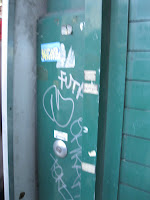
This second photo I would also classify as unnecessary. While it is a little less obnoxious than the telephone booth display, I still find it to be a little irritating. It's just a bunch of scribbled tags that communicate something that I don't feel like deciphering or even stopping to really look at (which probably can explain the blurry photo). [found in Piccadilly on a closed street vendor]
On the bus on the way to Piccadilly, i noticed this 'graffiti'. I don't really see this image as graffiti, nor art, since it's not some illegible tag and it's not a really creative artistic display. The word LOVE within the shape of a heart was eye catching for it's odd location and peaceful commentary. The location to me, indicates that it was meant to be viewed by drivers and there seems to be more effort and thought put into this simple display.  For some reason however, I find it difficult to categorize; it could be easily passed, it could be seen as unnecessary, but also could be appreciated. 

This last photo [courtesy of Lizzie Herrick due to my irresponsibly losing my camera] can be found in Bricklane. This absolutely falls into my category of street art-graffiti. It's a creative image, a stencil almost etched into the wall. Effort, thought, and purpose seems to be behind this display. It's a hard image to casually pass by without noticing and immediately provokes thought. I think the scribbled tags disappointingly take away from it as a whole.

Clearly my divisions do not have distinct basis for as I analyze them my arguments begin to play a tug-of-war in my head, but there are certain images that I can appreciate and others that I can do without. This world of street art and graffiti has always interested me though and I find it fun to explore in the different cities and areas that I visit. 

Monday, 21 March 2011

National Gallery Swarms


Upon entering the National Gallery, I was immediately filled with a sense of anxiety and became completely overwhelmed by the amount of people that suddenly seemed to swarm around me. The numerous group tours, the school children, the talking, etc. Everything came at once and was for some reason, most likely due to exhaustion, intensified to no end. 

Feeling as though i was crawling my way through an ant hill or scurrying around a maze with hundreds of other mice, I got lost and dizzy weaving in and out of rooms, trying to take in all the famous pieces of art that everyone need to get a taste of. The feeling only remained as i went from room to room, each changing in wall color and lighting to suit the works, and observing countless famous pieces that I had been learning of the past two years. Within each of these rooms I felt forced to navigate myself through twists and turns of the swarms; keeping away from massive blockades of tour groups, as well as the occasional smaller groups of people that would halt their walk through abruptly many times blocking the painting for dozens behind them, and then those individual sketch artists posted in the corners and awkward spots making them inevitable to bump into. As it was amazing to see the famous works of Michelangelo, Titian, Van Gogh, Monet, among many many others, the swarms made it hard to fully enjoy this museum experience. Because of this, I definitely have intentions to go back before I leave to avoid the swarming, the bumping, and awkward foot faults.  

Monday, 7 March 2011

The National Portrait Gallery


The logo for the National Portrait Gallery is quite boring and plain and doesn't convey any message that really suggests the pieces within the museum. I suppose the logo kind of conveys the same as the architecture of the building which is simple but pretty and a little plain looking. The varying types of portraits however, make it hard to focus on one font or coloration for the logo to capture a sense of what the museum is about.
The portrait drawn on the left is a sketch of Lauren Rosenfeldt as the Dame Anna Neagle, whose portrait was painted by McClelland Barclay in 1940. Anna Neagle was a British actress and was the first actress to appear on the cover of Life magazine. I felt this portrait best identified with Lauren instantaneously by the depiction of Neagle's beautiful bright red hair, a notable attribute of my now close friend. This portrait also reminded me of Lauren through the upright posture and body positioning in which Neagle's hands grasp her hips to accentuate her upper body- a pose commonly found in an array of photographs of Lauren. The fact that Neagle was a popular and beautiful actress parallels Lauren's outgoing and dramatic personality that make her so lovable. 


The sketch to the right is a self portrait as Wallis Duchess of Windsor, a portrait by Gerald Leslie Brockhurst in 1939. Wallis was an American born woman who met the Prince of Wales in London. While I do not consider myself to be anywhere near the status of a Duchess, I can only identify with the desire to be an American girl in London, meeting the Prince and being the lucky lady who charms him. I admire the beauty of Wallis as well as her simple and sophisticated style that is shown in the original portrait. 


This sketch of the portrait of Sir William Walton by Michael Ayrton (1948) reminded me of fellow abroad student Max Florian, firstly with the young boyish look and sense of comfort and contemplation. Upon reading the portrait's description I learned that Walton was a composer who was dedicated and enthusiastic about music, similarly to Max. Additionally I found it humorous that Walton's portrait included a pipe and a drink, as probably would a portrait of Max. 

The sketch on the left of this image is a portrait of Lauryn Besasie as Beatrix Potter painted by Delmar Banner in 1938. Potter, a writer, artist, conservationist, caught my eye with the distant and sweet smile that reminded me of Lauryn. The portrait conveys Potter's maternal sense that is evident in her love of children, which lead her to write children's novels (such as Peter Rabbit), which reminded me of Lauryn's nurturing personality. Lauryn is also a very "green" minded girl and can be caught sketching in her notebooks also identifies with Potter in this way. The sketch on the right is of Karl Iglesias as Walter Richard Sickert who painted a self portrait in 1935. Only upon reading the caption did I identify Karl with Sickert, who was an aspiring actor, and very interested in music and theatre. While conveying a sense of individual style in the self portrait, I decided that Karl also holds this individualized fashion sense and also thought it necessary to include his signature headphones with a mic in hand (in place of Sickert's original cane). 


Sunday, 20 February 2011

The National Gallery

The National Gallery logo seems to just be a type face than a logo. However, clearly this font was chosen for a reason, to convey a certain message, but further thought does not seem to be put into the decision. 
After viewing the collections I think more could be done with this typeface, maybe a color change or a background color. But I understand their simplicity and lack of logo since the museum itself is quite overwhelming. 
The changing wall colors of the galleries at the museum complement the works each room holds. I think the palettes also add to the overall feel of the pieces and intensify the experience of seeing such legendary works, which works for the museum - as do the white minimal walls of the Tate Modern. 
In my opinion, the van Gogh paintings definitely lived up to their position in art history! They even exceeded my expectations; with their vivid colors and lively brushwork I felt so awestruck in their presence. Wheat field with Cyprysses was a work i never imagined I'd be so amazed by. Standing about 8 feet away from it was the view point i though really did the work justice and to really see the artistry of van Gogh's brush work and coloration. 
The painting that would be most suitable for my future home would have to be of my favorite impressionist artists, Claude Monet. The beautiful painting The Beach at Trouville is aesthetically pleasing and apparently contains actual grains of sand from the beach on which he painted this scenic portrait. 
My favorite object from the National Gallery was Degas's After the Bath a Woman Drying Herself (1890-1895). This also might be an object I'd love to put in a future home. The beauty and admiration of the female figure is conveyed simply and elegantly with the medium of pastels. The flexibility and contortion of the body was an intrigue to Degas, and I would like to study other similar works to compare and contrast this to, especially of dancers. 
 I don't think plastering images of the works in the collection on handbags and such exactly diminishes the value of the original works, but i personally see it as tacky. I think that it's an interesting way to spread the image and make it more accessibly seen. Purchasing this merchandise though, is more affordable way to express a liking or taste in certain works as opposed to going to the Louvre or Tate Modern or Art Institute to see it and snap your own photo to prove you like something and saw it. 

Sunday, 13 February 2011

The Tate Modern


The Tate Modern building from the outside is quite cold, sort of resembling a prison. It's location however, directly at one end of the Millennium bridge adds to it's Modern feel. The building, not really looking like a museum, is not what I would choose to house a modern collection, but works fine. 
The logo of the Tate Modern varies in a range of blurred effects. The slight alterations of the blurred effect is a little distracting and conveys a sense of inconsistency, that perhaps was purposeful, but I find unnecessary. 
I wouldn't say that the museums in the United States are exactly for the rich, but more for those truly interested in taking the time to experience what museums have to offer. Obviously not everyone can afford to go to museums priced so highly as often as they could here in London, but this could motivate some of the public to put more effort in the outing. The free museum admissions impact the London culture in a positive way, making it more accessible to the public and allowing anyone the opportunity to explore their desired interests as well as offering new interests.  
I don't mind the white walls of the exhibition spaces within the Tate Modern. I believe this neutrality allows for a distraction-free experience for observing the works. The areas between displays, such as the wall of signatures and the timeline of different art periods is a good visual transition between spaces. 
The Unilever Series, comprised of millions of individual porcelain sunflower seeds was not personally intriguing to me. While I respect and see how interesting the time and work that went in to creating this installation and the obvious message message it conveys, it is not my taste. I prefer gallery pieces like paintings, photos and sculptures. 
Seeing the works of artists that I've studied in classes is always very exciting for me, and I find the period of Pollock's work to be the one of the most interesting I've studied. My favorite piece at the Tate Modern was Jackson Pollock's Number 14 (1951), from a period in his career that I have not studied much. It's different from his more famous works and I find it aesthetically pleasant and more simple in relation to those others. 

Friday, 4 February 2011

The Tate Britain


The Tate Britain museum's logo is so far the most unique of those we've critiqued. What bothers me about this logo is the energy it gives off; it seems to be the font one would see on the cover of a horror film, which I believe contrasts the meaning and status that the "Tate" name holds and stands for. Aside from this, the fading of the letters gives it a modern feel clearly relating to the galleries and collections within this museum. The architecture however, is classical in style, juxtaposing many collections found inside the Tate.
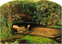
Last week we saw the production of Hamlet at the National Theatre. In the play, Ophelia's death is not depicted, but described through dialogue between the police and the King and Queen. It was said that Ophelia had fallen down a well. This lack of a visual depiction of her death held implications that she was in fact killed by authorities. This differs from Millais' painting of Ophelia's death firstly in that it is a visual depiction. Here, it looks as though she is entering a stream to drown herself. We see her right hand is still above water grasping a bundle of flowers and her face conveys a sense of disassociation- from life and sanity. 
The display techniques in the Tate differ greatly among galleries. In Gallery 11, the typical white walls hold large contemporary works. The simplicity of the art work parallels the simplicity of the room, which holds a few sitting areas is well lit. The light hits the pieces so that the colors appear bright and vivid. Gallery 9 holds art work created with through print making. These small paper works, framed and hanging were hard to look at, since it was not a well lit area. Each gallery speaks for the art work and installation it holds, and affects the way we experience the pieces and museum as a whole. 
One very interesting installation was "The Coral Reef", by Mike Nelson. Walking into this exhibit blindly may not have been the ideal mind set for most, but worked for me. Opening the first two doors, I felt as though I was entering storage areas of the museum, feeling as though I shouldn't have been seeing this area and second guessing my direction. This second guessing stuck with me throughout my entire experience, and eventually came in handy as I attempted to exit and came across a room identical to the entrance. As I explored the many rooms, the smell of saw dust and cement, the dim lighting, creaking doors, and random objects strangely reminded me of childhood. I felt as though I was exploring my grandmother's basement or my father's garage as I had done as a young girl. The mysteriousness of what the next room would hold was intriguing, and brought me back to my youthful curiosity that was most evident when grandma would ask me to get her something from the basement… the questions of where to go, what might pop out at me, and what else I could find on my mini adventure always kept me wide eyed in the dark and cold underground. Although unconventional, I absolutely think this qualifies as art; someone created and arranged each particular space and the exhibit as whole with specificity, purpose, and a desire to connect with others evoking thought and emotion. 
The contents of the Tate were more appealing to me than the Victoria and Albert Museum, since I love exploring art. However, the space and architecture of the V&A is more open and welcoming than the Tate, making it hard to decide which experience I favored more. 
I didn't find any piece or object that I would call my favorite, but I did have a favorite room in "The Coral Reef" exhibit, and I did find a piece of work that jumped out at me. The work that jumped out at me was in passing so i was not able to stop and gather the information. It was a photography piece that caught my eye because of it's similarity to the work of my brother. I was so astonished that I had to take a picture to compare to my brother's art. 

My favorite room of The Coral Reef exhibit had few objects, just a crate holding various bottles and a newspapered floor, but a beautifully painted ceiling with a 6-pointed star and script writing surrounding the star in circles. This ceiling reminded me of a hang out room at one of my friend's houses back home in Chicago, which she and other friends painted themselves and where I've spent much time during high school and most times when I'm home for breaks. 
My overall experience at the Tate was great, and I will definitely return since I know there is much more to explore. 

Sunday, 30 January 2011

The Victoria & Albert Museum

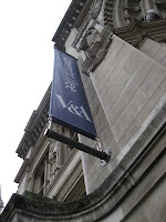
At first glance, the logo for the Victoria & Albert Museum may be considered plain and boring. However, through further observation and in relativity to other logos seen, it's actually quite appealing. The shortened abbreviation of black and white colored font- similar to Times New Roman- combine to convey a simple and elegant look, matching but not overpowering the exterior of this beautiful, aged building. The connecting of the "and" sign with the letter 'A' unifies the two letters in an original way, giving it a charming quality with a fresh and modern twist. Upon entering the museum, I immediately noticed a more literal 'modern twist' hanging above the information desk; the bright blues and yellows of the giant chandelier pop out at visitors in a mass of curly glass-blown whisps. 
Upon entering the first room of the Cast Courts, I was instantly overwhelmed by the large dark objects that seemed to be cramped into this gallery. The two large plaster pillars take up large amounts of space as do the creepy cast coffins that line up and down parts of the room. Once I got past the poor layout of these pieces in the first room, I was able to study the objects and acknowledge the beautiful detailing that went into their originals. Presented in most if not many objects here were biblical scenes and stories, showing the importance of religion specific to the time and place, as well as the passing of and holding onto history that was of significance. 
The second room of the Cast Courts was much less dark and claustrophobic. Although parts of this room and it's layout are currently under construction, the pieces that had a place were dispersed in ways that emphasized their original functionality (i.e. altar pieces and pulpits). Other pieces such as fragments of an altar, were hung high on the walls to display them in odd places, perhaps so that visitors would notice them more obviously. 
I feel as though the icons/symbols presented in the Isotype exhibition, convey less personality than those of the international system of signs. These icons/symbol cut down to the core of the symbols and give people the ability to add or subtract elements to their liking, making them more accessible. Through personal observations, symbols today that have evolved from the international system of signs vary in personalization. Because of the lack of personality of the templates, they allow some icons/symbols to become more or less simplified or less while still having the original elements. 
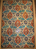
This particular image from the Ironwork collections, uses a repetitive geometric motif that conveys a kind of overwhelming aesthetic. the more i look at it, i seem to get a little bit of a headache. The figure ground relation is balanced but not exactly in a pleasant way. The addition of multiple 'x' figures in two different sizes is a little much. In comparison to the Middle East tile work, this ironwork is quite boring. The middle east tile work is a more pleasant motif incorporating both organic and geometric figures. The color use also adds to the nice aesthetic, high lighting the more organic figures within the piece. 
I'm very unfamiliar with the Metro transportation in Madison so i wouldn't really know how to compare it to the Underground. I suppose that the Underground and bus system is essential to get around a much bigger city than Madison. The Underground is very much so a part of the city of London, which i feel is drastically different than Madison. From what i see and know Madison is more of a biking town, and while there is a large biking system here, i don't see it to be as prominent. 

As an art history major, one of the most impressive and brilliant things I saw were the Raphael cartoons. I was not particularly interested in any cartoon specifically, but seeing all of them in person after studying Raphael this past semester was exciting. Unfortunately photography was not allowed in this exhibit. I would definitely go back to that exhibit to study the images further seeing as i was not able to spend much time in there before the class tour. 

Sunday, 23 January 2011

London's Science Museum

The logo of London's Science Museum attempts to convey a scientific feel through a technological text. The solid, straight lines and boxy aesthetic remind me of the type that was used in old nintendo video games making it relatable to my generation and probably younger ones too. The fact that it reads chopped up horizontally, yet balanced in presentation, causes the viewer to complete and connect the words instinctively. The calming blue color applied provides a calming yet sophisticated look, emphasizing the status of the establishment. 
When reading the map to navigate through the Science Museum, one is presented with a map legend easy to decipher and locate desired exhibits on the minimalized blue print of each floor. Posted on many walls throughout the building, oversized maps of current floors are hard to miss, and convenient if one gets turned around or lost. The openness of the museum allows visitors to comfortably walk on any pathway they desire. 
Although small, the cafe of the museum offers a well lit area for fine dining shall visitors acquire the need for snacks or meals. The same font seen in the museum logo is used to advertise this area as well. The shop, located next to the cafe on the main floor, appeals entirely to a younger audience interested in toys and science related activities. 
Throughout the museum many objects are displayed in cases, hanging from the ceiling, or surrounded by ropes. Others are made for the purpose to be physically handled by visitors. Floors such as the first, with the exhibit "Who am I?" offered multiple high tech machines and interactive activities for people to learn about themselves. Text is definitely integrated into displays of exhibits, however a more readable text is used when informational plaques are presented. Objects in display cases emphasize the importance or rarity of them, showing they are to be protected yet worth seeing. 
My favorite exhibit was located on the ground floor and included displays of old cars and planes. Although the layout could have been overwhelming due to size, they were all distributed throughout the floor plan in a cohesive and balanced manner. While not crucial-life-changing of a display, the ground floor included a Euthanasia Machine. The information plaque explained that it was used on four ill people who chose to end their lives, a procedure that was legal in Australia's Northern Territory from 1995-1997.