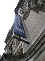
 At first glance, the logo for the Victoria & Albert Museum may be considered plain and boring. However, through further observation and in relativity to other logos seen, it's actually quite appealing. The shortened abbreviation of black and white colored font- similar to Times New Roman- combine to convey a simple and elegant look, matching but not overpowering the exterior of this beautiful, aged building. The connecting of the "and" sign with the letter 'A' unifies the two letters in an original way, giving it a charming quality with a fresh and modern twist. Upon entering the museum, I immediately noticed a more literal 'modern twist' hanging above the information desk; the bright blues and yellows of the giant chandelier pop out at visitors in a mass of curly glass-blown whisps.
  Upon entering the first room of the Cast Courts, I was instantly overwhelmed by the large dark objects that seemed to be cramped into this gallery. The two large plaster pillars take up large amounts of space as do the creepy cast coffins that line up and down parts of the room. Once I got past the poor layout of these pieces in the first room, I was able to study the objects and acknowledge the beautiful detailing that went into their originals. Presented in most if not many objects here were biblical scenes and stories, showing the importance of religion specific to the time and place, as well as the passing of and holding onto history that was of significance.
  The second room of the Cast Courts was much less dark and claustrophobic. Although parts of this room and it's layout are currently under construction, the pieces that had a place were dispersed in ways that emphasized their original functionality (i.e. altar pieces and pulpits). Other pieces such as fragments of an altar, were hung high on the walls to display them in odd places, perhaps so that visitors would notice them more obviously.
 I feel as though the icons/symbols presented in the Isotype exhibition, convey less personality than those of the international system of signs. These icons/symbol cut down to the core of the symbols and give people the ability to add or subtract elements to their liking, making them more accessible. Through personal observations, symbols today that have evolved from the international system of signs vary in personalization. Because of the lack of personality of the templates, they allow some icons/symbols to become more or less simplified or less while still having the original elements.
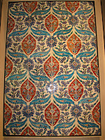
 This particular image from the Ironwork collections, uses a repetitive geometric motif that conveys a kind of overwhelming aesthetic. the more i look at it, i seem to get a little bit of a headache. The figure ground relation is balanced but not exactly in a pleasant way. The addition of multiple 'x' figures in two different sizes is a little much. In comparison to the Middle East tile work, this ironwork is quite boring. The middle east tile work is a more pleasant motif incorporating both organic and geometric figures. The color use also adds to the nice aesthetic, high lighting the more organic figures within the piece.
  I'm very unfamiliar with the Metro transportation in Madison so i wouldn't really know how to compare it to the Underground. I suppose that the Underground and bus system is essential to get around a much bigger city than Madison. The Underground is very much so a part of the city of London, which i feel is drastically different than Madison. From what i see and know Madison is more of a biking town, and while there is a large biking system here, i don't see it to be as prominent.
 As an art history major, one of the most impressive and brilliant things I saw were the Raphael cartoons. I was not particularly interested in any cartoon specifically, but seeing all of them in person after studying Raphael this past semester was exciting. Unfortunately photography was not allowed in this exhibit. I would definitely go back to that exhibit to study the images further seeing as i was not able to spend much time in there before the class tour.


